Oakville Transit.
Oakville Transit.
OVERVIEW
The problem
Oakville Transit is an app tailored for travel within the town of Oakville. Our team faced the challenge of redesigning the Oakville Transit app to enhance its design and performance, particularly for both regular commuters and those new to bus travel, in response to low user ratings.
Objective
The Oakville Transit app redesign will optimize the commuting bussing experience with effortless user control and navigation. Easy and convenient to use for those inexperienced bus users and will decrease the chance of user error during commutes.
My Roles
UX/UI design
Tools
Figma, Mural,
Google Office
Duration
3 months
DISCOVERY
Identifying the Problem
We analyzed and tested the app in order to identify all visible flaws. We then looked over the reviews and further identified common usability errors.

Gathering insight
- The user interface for Oakville Transit is dull, outdated and difficult to navigate. The app has not been updated in 3 years, and is not compatible for screens larger than 4.7 inch display.
- Low satisfaction due to frustrating usability and functionality. Users did not find the app helpful when taking the bus and many users would delete the app after only a short period of using it.
- Design flaws in information display. The app limited user usability, and features did not display information in a reliable way.
Leading design research questions:
- How will we identify the issues that need to be resolved?
- How will we determine what need to be implemented in the re-design?
- How can we maximize the commuting experience for bus users and present user errors?
Interviews
Perceived severity ≠ frequency
As part of our early research, we interviewed high school and college students ages 16–25, specifically aligning with Ontario’s minimum age for independent transit use.
Key Findings:
- The most frustrating pain points were not often the most common occurring.
- Critical failures are less frequent but high impact (ie. events like buses not arriving are rare but strongly affect user trust.)
To address the gap between perceived severity and frequency, I organized these scenarios into a matrix to prioritize user needs and target key pain points:

DEFINING
Persona profiles
Taking a look at the student demographics
Based on the data gathered from the interviews, two distinct user personas were developed. These personas accurately reflect the characteristics, pain points, and goals identified during the interviews. Each persona has unique objectives and realistic user goals that must be addressed.


Behavioural attributes map
Ensuring reliability for all personality types
In order to better understand how various personal attributes may influence a users commuting experiences, we created a behavioral attributes map using our two personas. Since these personas were formed based on interviews with real bus users, this process enables us to better visualize their behavior during commutes, and will also aid in constructing our journey maps later.

Journey mapping
Identifying key interaction points
We mapped user scenarios into a journey flow to understand key interactions with the transit app, highlighting moments where the experience could better support user needs. This also established the overall experience narrative, guiding early design decisions and defining core interactions before wireframing.

Ideation Output
Opportunity Mapping
We conducted a brainstorming session to identify key opportunities that could simplify commuting, increase confidence, and create a more connected experience for users. After synthesizing our ideas, we aligned on a focused direction that balances user needs with business goals. We prioritized this key area to streamline the experience and drive the greatest impact.

PROTOTYPING
Sketches & Wireframes
Designing the User Flow
The sketches explore solutions to key commuter pain points while improving the app. They focus on core features: sign-in for saved data, intuitive bus tracking, a clear schedule, and an alert system.

The flowchart defined interactions, UI elements, and page structure, guiding both development and user flow. The experience moves from the loading screen to two paths that lead to the same goal.

One of our starting goals was to update the UI. We decided to remove the bottom navigation bar as it felt outdated, therefore we explored other interface possibilities. We concluded that implementing spacing offers better visibility for each button, which would overall help with error prevention.

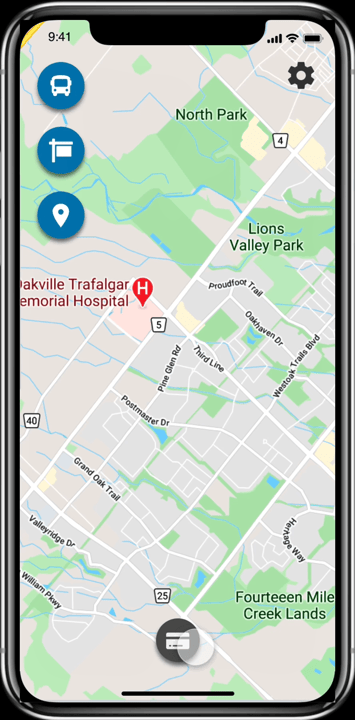
FINAL DESIGN
Here is a side by side comparison of the changes that were made and new features that were implement for the Oakville Transit app. It should be noted that even though the interface has clearly been updated, the new design is still consistent with the branding of the Oakville Transit app.

New Design
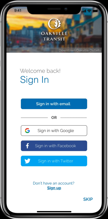
Previous


New Design
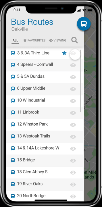
Previous


New Design
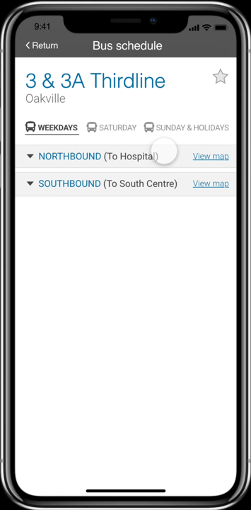
Previous


New Design
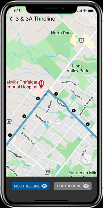
Previous


New Design
Takeaway
- Deepened my ability to apply heuristic evaluation and iterative testing to uncover and address usability issues.
- Gained a clearer understanding of how collaboration shapes stronger, more thoughtful outcomes.
- Recognized the impact of small design choices on overall accessibility and user experience.
- Strengthened my confidence in using data and comparative analysis to guide design decisions.
- Came away with a more intentional, user-centered mindset that informs how I approach future work.


